


Improving your e-commerce conversion rates starts with one simple, foundational truth: you can’t optimize what you don’t measure. Before you start tweaking buttons or A/B testing headlines, you have to know exactly where you stand. This means getting a clear baseline across every channel from your DTC site to marketplaces like Amazon and Walmart, and understanding the critical gap between desktop and mobile shoppers.
This initial analysis isn’t just a box to check; it’s the roadmap that will guide every single decision you make from here on out.
Setting the Stage for Conversion Rate Success
Jumping straight into A/B testing or redesigning product pages without a clear starting point is like driving without a destination. It’s a waste of time and money. The first real move in any successful Conversion Rate Optimization (CRO) playbook is a deep-dive conversion audit. This isn’t about finding a single vanity metric; it’s about painting a complete picture of user behavior to pinpoint your biggest growth opportunities.
Your audit needs to be multi-faceted. Looking at a single, sitewide average is a rookie mistake. A true baseline requires slicing your data to uncover the hidden truths.
- Channel-Specific Performance: How do your conversion rates on your Shopify store compare to your Amazon listings or your Walmart presence? Each platform has a unique audience and user journey, and your numbers will absolutely reflect that.
- Device Breakdown: What’s the gap between your desktop and mobile conversion rates? It’s almost always a given that mobile will lag, but a massive difference screams that you have critical friction in your mobile experience that needs to be fixed now.
- Traffic Source Analysis: Are visitors from your Meta ads converting at a different clip than those from organic search or email campaigns? Knowing which channels bring in high-intent traffic is key to spending your ad budget wisely.

What Is a Good Ecommerce Conversion Rate?
One of the first questions I always get is, “What’s a good conversion rate?” The honest answer is always, “It depends.” Generic averages are dangerously misleading. A brand selling high-ticket furniture will naturally have a much lower conversion rate than a CPG brand selling affordable snacks.
For context, the global average has been hovering around 1.9% to 2.9% as of 2025. It’s a tough market out there. But the real players—the top-performing stores—consistently hit rates above 3.2%, putting them in the top 20% of all digital storefronts.
This is a massive opportunity. That relatively low global average is a huge growth lever for any brand that’s serious about optimization.
The table below breaks down some realistic targets. It’s a good starting point to see where you stack up and where the biggest opportunities might be, especially when you look at the difference between desktop and mobile.
Ecommerce Conversion Rate Benchmarks by Industry and Device
A summary of realistic conversion rate targets for key ecommerce sectors, highlighting the performance gap between desktop and mobile to inform optimization priorities.
| Industry / Device | Average Conversion Rate (%) | Top Performer Goal (%) |
|---|---|---|
| Fashion & Apparel (Desktop) | 2.8% | 5.5% |
| Fashion & Apparel (Mobile) | 1.6% | 3.5% |
| Health & Supplements (Desktop) | 3.5% | 6.0% |
| Health & Supplements (Mobile) | 2.1% | 4.0% |
| Home Goods (Desktop) | 2.2% | 4.5% |
| Home Goods (Mobile) | 1.2% | 2.8% |
| Beauty & Cosmetics (Desktop) | 3.1% | 5.8% |
| Beauty & Cosmetics (Mobile) | 1.9% | 3.9% |
Instead of getting fixated on a universal number, use industry-specific benchmarks as a guide. Your most important metric, however, is your own baseline and whether you’re improving it month over month.
Key Takeaway: A “good” conversion rate is relative. For mid-market brands in competitive spaces like Beauty, Supplements, or Apparel, a rate of 2% might be the floor, while 4-6% is a realistic and aggressive goal to work toward.
Conducting Your Foundational Audit
To get this data, you’ll need to roll up your sleeves and get into your analytics tools. Google Analytics 4 (GA4) is your best friend for your DTC site. Use it to build custom reports that segment conversions by device, traffic source, and user demographics.
For marketplaces, Amazon Brand Analytics and Walmart’s Seller Center provide the core insights you need, especially around listing traffic and unit session percentage—their version of a conversion rate.
Get all these numbers into a central dashboard. This creates a single source of truth to track progress and hold your team accountable. This audit gives you the “before” picture, which is the non-negotiable first step in any data-driven journey toward higher conversions. For brands serious about scaling, this is a core part of their overall https://clickstera.com/blog/e-commerce-growth-strategies/.
With this baseline locked in, you’re no longer guessing. You’re making informed, strategic decisions that drive real results.
Optimizing Your Digital Shelf Experience

Your digital shelf—whether it’s a product page on your DTC site, an Amazon listing, or a Walmart detail page—is the final battleground. This is where a casual browser decides to become a customer. Getting this space right is one of the highest-impact moves you can make, turning basic product specs into a compelling experience that actually sells.
This isn’t just about listing features. It’s about telling a story that clicks with your ideal customer’s problems and goals. Every single element, from your title down to the last customer photo, needs to work together to build confidence and spark desire.
Crafting High-Converting Titles and Bullets
First impressions are everything, and on a product page, that’s your title and bullet points. Shoppers give you seconds to convince them your product is a potential solution. Your job is to make that decision an effortless “yes.”
Think of your title as the ultimate hook. It needs to be packed with the right keywords for search visibility but also framed with benefits for the human on the other side of the screen. Instead of a generic “Vitamin C Serum,” a much stronger title is “Brightening Vitamin C Serum with Hyaluronic Acid for Dark Spots & Fine Lines.” It immediately speaks to specific pain points.
Your bullet points are where you seal that initial deal. Don’t just list what your product is; explain what it does for the customer.
- Lead with the Benefit: Kick off each bullet with the end result. Instead of “Contains 20% Vitamin C,” try “Fades Dark Spots & Boosts Radiance with a potent 20% Vitamin C formula.”
- Address Objections Head-On: Will your skincare product work on sensitive skin? Is your supplement third-party tested? Use your bullets to proactively answer these common hesitations before they become deal-breakers.
- Speak Their Language: Dive into your customer reviews and pull out the exact words and phrases your happiest customers use. Mirroring their language builds an instant, authentic connection.
Expert Tip: On marketplaces like Amazon, remember that titles and bullets are heavily weighted by the search algorithm. The trick is to seamlessly blend your most important keywords with compelling, benefit-focused copy. You have to satisfy both the algorithm and the shopper. Getting this right is a cornerstone of effective Amazon listing optimization.
The Power of A+ Content and Brand Storytelling
Below the fold is where you deepen the relationship. On Amazon, this is your A+ Content; on your DTC site, it’s your rich media section. This is your chance to move beyond text and use powerful visuals to tell your brand’s story, show your product in action, and drive home your unique value.
Use this space to visually answer key questions and build trust. A sharp comparison chart showing how your product stacks up against the competition can be incredibly persuasive. Lifestyle images that help customers picture themselves using and loving the product can be the final nudge they need to buy.
This visual real estate is far too valuable for generic marketing fluff. It should be a direct extension of your product’s core benefits, designed to make the buying decision feel not just smart, but exciting.
Leveraging User-Generated Content for Social Proof
Let’s be honest: nothing sells a product better than a crowd of happy customers. User-generated content (UGC)—reviews, customer photos, and videos—is the most powerful and authentic form of social proof you have. In a world of polished brand messages, UGC cuts through the noise with the unbiased validation shoppers are looking for.
The numbers are staggering. Simply having UGC on a page can lift conversion rates to 3.2%, but the real magic happens when people engage with it. When visitors interact with customer photos and reviews, conversion rates can jump by another 3.8%. Even better, users who actively engage with UGC are twice as likely to purchase, boosting conversion rates by a massive 102%. You can dig into more of these powerful conversion rate optimization statistics on Wordstream.
To make this work for you, you need a system for both collecting and showcasing it.
- Automate Review Requests: Use post-purchase email flows to ask for reviews. Make it dead simple for customers to share their feedback.
- Incentivize Photo and Video Submissions: Run contests or offer small discounts for customers who share photos of themselves using your product on social media.
- Feature UGC Prominently: Don’t bury customer photos in some hidden gallery. Weave them directly into your product pages, especially near the “Add to Cart” button where they’ll have the most influence.
From Pricing to Payout: How to Eliminate Checkout Friction
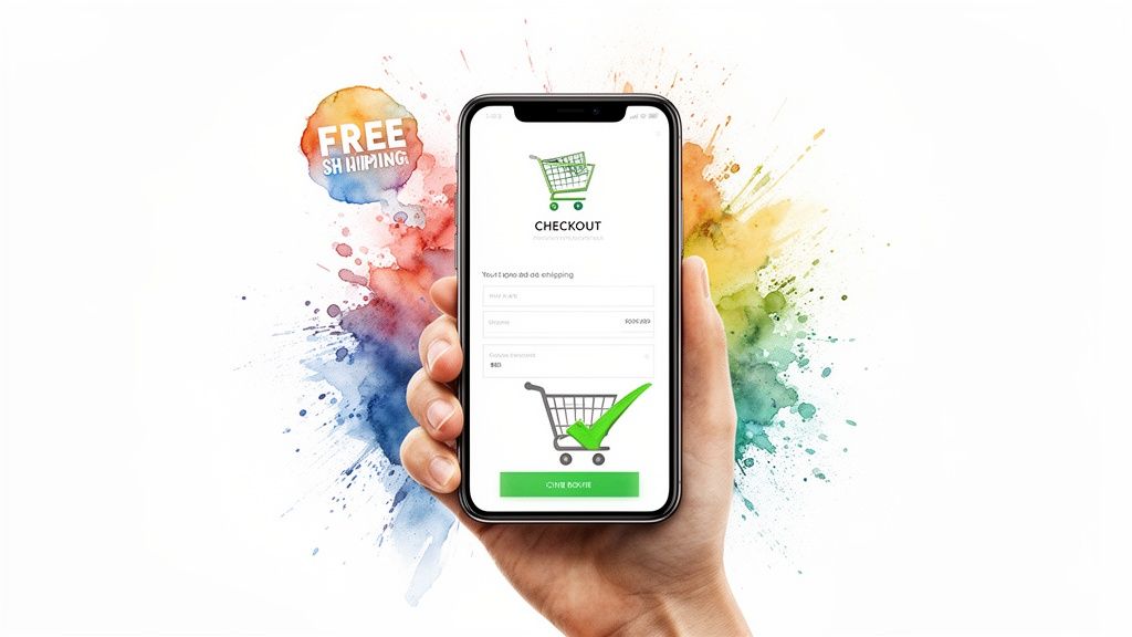
You’ve done the hard part. You’ve built a fantastic digital shelf, written compelling copy, and earned a shopper’s trust. They finally clicked “Add to Cart.” This is the moment of truth, but for so many brands, it’s exactly where the sale falls apart.
This final stretch of the customer journey, from cart to confirmation, is littered with conversion killers.
The data tells the story loud and clear. Cart abandonment is a massive hurdle, with rates soaring past 70% in 2024. And for shoppers in the United States, the number one reason they leave is painfully simple: unexpected costs. They get blindsided by shipping fees, taxes, and other charges that inflate the total at the last second. This is a huge opportunity to boost conversions through sheer transparency. For a deeper dive, check out these global conversion rate insights on Statista.
Tackle Unexpected Costs with Brutal Honesty
The fastest way to kill trust at checkout is with a surprise fee. The price a customer sees on the product page needs to be as close as possible to the final price they pay. Hiding shipping costs until the very last step is a guaranteed way to send buyers running for the exit.
Instead, be radically transparent.
Put a shipping calculator right on the product or cart page. Use geo-IP detection to estimate taxes and fees upfront. This isn’t about revealing extra costs; it’s about managing expectations and eliminating the sticker shock that fuels abandonment.
An even better approach is to reframe shipping entirely. Don’t just list it as a cost—turn it into a value proposition.
- Set a Free Shipping Threshold: “Free shipping on orders over $50” is easily one of the most powerful incentives in ecommerce. It not only removes a point of friction but also nudges customers to increase their average order value.
- Offer Flat-Rate Shipping: If a threshold isn’t feasible, a simple, predictable flat rate like “$5 standard shipping” is far better than a variable cost that shoppers can’t anticipate.
- Build Shipping into the Product Price: For some business models, it makes perfect sense to slightly increase product prices to offer “free” shipping on everything. The psychological power of “free” often outweighs a minor price bump.
Streamline Your Checkout Flow
Once pricing is clear, the next friction point is the checkout process itself. Every field a customer has to fill out, every click they have to make, is another chance for them to second-guess their purchase. The goal is to make checking out feel effortless and totally secure.
Key Insight: A modern checkout should feel less like filling out tax forms and more like a guided conversation. Remove every non-essential field. Do you really need their phone number for a digital download? Probably not.
Start by auditing your current flow. Count the fields. Count the steps. Then, start cutting.
Actionable Checkout Simplification Tactics
| Tactic | Why It Works | Real-World Example |
|---|---|---|
| Guest Checkout | Forcing account creation is a major conversion killer for new customers. | An apparel brand lets first-time buyers check out with only an email, then prompts for an account post-purchase. |
| Address Autofill | Using tools like the Google Places API reduces typing and costly errors. | A home goods store’s address field auto-completes the city and state as the user types their street. |
| Express Payment Options | Wallets like Apple Pay, Google Pay, and PayPal let users bypass manual entry. | A supplement brand places the PayPal Express Checkout button right at the top of the cart, letting users skip the form entirely. |
| Single-Page Checkout | Keeping all fields on one page reduces clicks and the feeling of a long, drawn-out process. | A cosmetics site uses an accordion-style checkout on a single page, showing all steps without reloading. |
Build Last-Minute Trust with Security Signals
As customers get ready to enter their credit card information, their sensitivity to security is at its peak. This is where you absolutely must reassure them that their data is safe. A lack of trust signals can feel sketchy and is often enough to make someone abandon their cart, even if everything else was perfect.
Prominently display trust badges from well-known security providers like Norton or McAfee. Just as important, show the logos of the payment methods you accept—Visa, Mastercard, American Express, PayPal. These familiar symbols act as a powerful visual shorthand for legitimacy, reinforcing the customer’s decision to complete the purchase. This is a small but critical step for improving ecommerce conversion rates, as it directly tackles that last-minute hesitation.
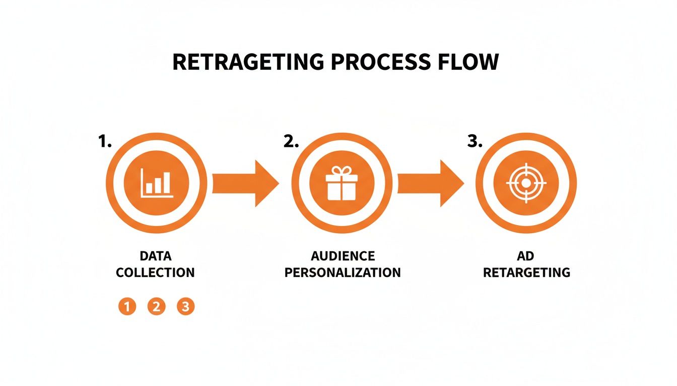
Once your digital shelf is polished and your checkout flows smoothly, it’s time to stop talking to the crowd and start having one-on-one conversations. Generic marketing just doesn’t cut it anymore. Real growth comes from using data to create highly personalized experiences that make every single shopper feel like you get them.
This isn’t about surface-level analytics. It’s about diving deep into user behavior and turning raw data from tools like GA4 and marketplace reports into smart moves that power both your on-site experience and your off-site retargeting.
Turning Behavior into Personalized Experiences
Every click, search, and page view is a clue. A shopper who has looked at three different vegan protein powders is on a completely different journey than someone who just added pre-workout to their cart. If you treat them the same, you’re leaving money on the table.
Smart personalization uses this behavioral data to change your website in real-time. Instead of showing everyone the same bestsellers on the homepage, you tailor what they see based on what they’ve already shown you they’re interested in.
- Dynamic Product Recommendations: If a user has been browsing running shoes, your site should be smart enough to show them performance socks, GPS watches, or hydration packs—not tennis rackets.
- Behavior-Triggered Offers: Did a shopper spend five minutes comparing two high-end blenders? A perfectly timed pop-up offering 10% off one of those specific models can be the final nudge they need.
- Personalized Content: For a returning customer who previously bought skincare for sensitive skin, your homepage banner could feature a new, hypoallergenic product line.
This level of personalization makes shopping feel less like a transaction and more like a helpful, guided experience. It proves you’re paying attention, which is a powerful way to build trust and get the sale.
Crafting High-Impact Retargeting Campaigns
Let’s be real: most visitors won’t convert on their first visit. That’s where a sharp retargeting strategy comes in. It’s your second, third, and fourth chance to bring interested shoppers back to finish what they started. But just showing the same generic ad to everyone who visited your site is a fast track to ad fatigue and wasted cash.
Effective retargeting is all about precise audience segmentation. You have to separate the casual window shoppers from the high-intent cart abandoners and speak to each group differently.
Example Retargeting Segments
| Audience Segment | Retargeting Strategy | Ad Creative Example |
|---|---|---|
| Viewed a Product Page | Show them the exact product they viewed, along with similar items. | “Still thinking it over? Your perfect running shoe is waiting for you.” |
| Abandoned Shopping Cart | Remind them what’s in their cart, maybe with a small incentive. | “Did you forget something? Complete your order now and get free shipping!” |
| Past Purchasers | Promote complementary products or new arrivals related to what they bought before. | “Love your protein powder? Try our new BCAA formula to boost your recovery.” |
This segmented approach lets you meet users exactly where they are in their journey. For brands ready to master this, understanding the details of smarter audience targeting in full-funnel retail media is essential for making sure your ad spend actually leads to conversions.
By using data to get the right message to the right person at the right time, you turn retargeting from a simple reminder into a powerful, personalized tool. This creates a more compelling customer journey, guiding shoppers back to your store and turning that initial flicker of interest into a sale.
Building a Continuous Optimization Framework
Getting your conversion rate up isn’t a destination you arrive at; it’s a journey you stay on. All the hard work you’ve put into your digital shelf and checkout flow is a massive step forward, but the ground is always shifting. Customer expectations evolve, your competitors adapt, and market trends change. To keep winning, you need a system for continuous improvement.
This is the point where you graduate from one-off projects to building a true culture of data-driven optimization. A structured A/B testing program is the engine that drives this culture. It pulls you out of the guesswork game and replaces gut feelings with hard evidence, making sure every change you make is a step in the right direction.
Prioritizing Your A/B Tests for Maximum Impact
You could test a thousand different things on your site, but let’s be real—your time and resources are limited. The secret to a killer testing program is ruthless prioritization. You have to focus your energy where it’s going to generate the biggest return, and a simple impact/effort matrix is the perfect tool for the job.
This framework helps you sort your test ideas into four buckets:
- High Impact, Low Effort (Quick Wins): These are your no-brainers, your top priorities. Think about testing a new headline on your homepage or changing the colour of your “Add to Cart” button.
- High Impact, High Effort (Major Projects): These are bigger swings, like a full checkout redesign. They need more planning but can deliver game-changing results.
- Low Impact, Low Effort (Fill-in Tasks): These are small tweaks you can run when you have a bit of downtime, like testing different font sizes in your footer.
- Low Impact, High Effort (Avoid These): These are the time-sucks. They burn through resources for almost no gain and should be pushed to the bottom of the list or ignored completely.
When you map out your ideas like this, a clear, strategic roadmap starts to emerge. You’ll naturally find yourself zeroing in on your highest-traffic pages and the most critical steps in your funnel, like product detail pages and the cart, where even a tiny lift can mean a serious bump in revenue.
Expert Insight: Don’t get lost in the weeds testing tiny details on low-traffic pages. Start where the eyeballs are. A 0.5% conversion lift on a product page with 50,000 monthly visitors is far more valuable than a 5% lift on a page that only gets 500.
Creating a Pipeline of Effective Test Ideas
Once you know how to prioritize, you need a steady flow of strong hypotheses to test. Your best ideas will always come from data—either from your analytics or directly from customer feedback. Here are a few concrete examples to get the wheels turning.
Homepage & Category Pages
- Hypothesis: Replacing a static hero image with a short, benefit-focused video will grab attention and drive more clicks to product pages.
- Hypothesis: Featuring a “Trending Now” section based on real-time sales data will pull in more clicks than a generic “New Arrivals” block.
Product Detail Pages (PDPs)
- Hypothesis: Changing the primary Call-to-Action (CTA) from “Add to Cart” to “Buy Now & Get Free Shipping” will boost add-to-cart rates.
- Hypothesis: Moving customer-submitted photos above the fold will build social proof and increase conversions.
Cart & Checkout
- Hypothesis: Adding express payment options like Apple Pay and Google Pay above the standard credit card form will cut down on checkout abandonment.
- Hypothesis: Pitting a “15% off” offer against a “Free Shipping” offer for first-time buyers will show us which incentive really motivates them.
This process, using data to create more relevant customer touchpoints, is the foundation of any strong testing and personalization strategy.
It all starts with collecting user data. That’s the essential first step that allows you to personalize offers and, eventually, retarget users with messages that actually resonate.
A structured testing roadmap keeps your optimization efforts focused and aligned with business goals. Instead of running random tests, you systematically work through the user journey, tackling the highest-impact areas first. Here’s what a simple roadmap might look like:
Sample A/B Testing Roadmap for an Ecommerce Brand
| Funnel Stage | Test Hypothesis | Primary Metric | Priority (Impact/Effort) |
|---|---|---|---|
| Homepage | Replacing a static hero banner with a product benefits video will increase clicks to category pages. | Click-Through Rate (CTR) | High / Low |
| Product Page | Adding a “Frequently Bought Together” bundle offer will increase the Average Order Value (AOV). | Average Order Value | High / Medium |
| Product Page | Changing the CTA button colour from grey to bright orange will increase “Add to Cart” clicks. | Add to Cart Rate | Medium / Low |
| Cart | Displaying trust badges (e.g., “Secure Checkout”) more prominently will reduce cart abandonment. | Cart Abandonment Rate | High / Low |
| Checkout | Removing optional form fields (e.g., “Company Name”) will increase checkout completion rates. | Checkout Conversion Rate | Medium / Low |
| Post-Purchase | Offering a 10% discount on the next purchase on the “Thank You” page will increase repeat purchases. | Repeat Purchase Rate | Medium / Medium |
This roadmap isn’t just a list; it’s a strategic plan. It ensures you’re always working on tests that have the potential to move the needle, rather than getting sidetracked by low-impact experiments.
Ensuring Data Accuracy with GA4 and Tag Manager
An A/B test is only as good as the data it produces. If your tracking is off, you could make a catastrophic decision based on flawed results. That’s why rock-solid, accurate tracking with Google Analytics 4 (GA4) and Google Tag Manager (GTM) is completely non-negotiable.
Think of GTM as the central nervous system for all your tracking tags. It lets you deploy and manage conversion pixels, event tracking, and other scripts without having to beg a developer to edit your site’s code. This agility is a game-changer for setting up tests quickly and accurately.
Use GTM to fire specific events for every single variation in your A/B test. For example, if you’re testing two different “Add to Cart” buttons, you should have a unique event for clicks on Variant A and another for clicks on Variant B. This level of detail is what allows you to see precisely how each version performs in GA4, ensuring your conclusions are built on a foundation of clean, reliable data.
Common Ecommerce Conversion Questions
Navigating the world of conversion optimization always brings up questions. It’s only natural. As you move from foundational audits to more advanced A/B testing, you’re bound to hit practical roadblocks and wonder if you’re even on the right track.
Here are some of the most frequent questions we hear from growing ecommerce brands, with clear, actionable answers to help you make smarter decisions.
What Is a Good Ecommerce Conversion Rate?
Let’s get one thing straight: a “good” conversion rate is completely relative. It’s highly dependent on what you sell. While you’ll see global averages floating around 2-3%, that number can be seriously misleading. A luxury furniture brand will naturally have a lower conversion rate than a store selling phone cases.
Instead of getting hung up on a universal number, focus on two things that actually matter:
- Your Industry’s Benchmark: If you’re in a competitive niche like beauty or supplements, a 2% rate is a decent starting point. The real top performers, though, are pushing for 4-6%. That’s a strong goal to aim for.
- Your Own Progress: The most important metric is your own baseline. Are you consistently improving month-over-month? That’s the true sign of a CRO program that’s actually working.
And remember, mobile conversion rates are often about half that of desktop. Always segment your data by device to get an accurate picture of what’s really going on.
Your goal isn’t just to meet an average; it’s to create an experience so seamless and compelling that you consistently outperform your industry’s benchmark.
How Can Product Pages Improve Conversion Rates?
Your product pages are where the sale is won or lost. They are, without a doubt, the most critical piece of the entire conversion puzzle. To turn casual browsers into committed buyers, your pages need to build unshakable confidence and create genuine desire.
Focus your energy on these high-impact elements:
- High-Quality Visuals: Don’t skimp here. Use multiple high-resolution images, 360-degree views, and in-context lifestyle photos. Let shoppers see, feel, and imagine every detail.
- Authentic Social Proof: Prominently feature customer reviews, star ratings, and user-generated photos. Shoppers trust other shoppers far more than they’ll ever trust a brand’s marketing copy.
- Benefit-Driven Copy: Stop just listing features. Explain how each feature solves a problem or makes the customer’s life better. You need to answer their unspoken question: “What’s in it for me?”
- Clear and Obvious CTAs: Your “Add to Cart” button should be impossible to miss. Use a bold, contrasting color that pops off the page and draws the eye.
What Are Some Low-Effort Ways to Boost Conversions?
You don’t always need a full-blown site redesign to see a lift. Some of the most effective tactics for improving ecommerce conversion rates are actually simple, low-effort changes that chip away at friction and build trust.
Start with these quick wins:
- Add Trust Badges: Display security seals (like Norton or McAfee) and accepted payment logos (Visa, PayPal, etc.) right near your checkout button. It’s a small visual cue that goes a long way.
- Offer a Guarantee: A clear “30-Day Money-Back Guarantee” or “Hassle-Free Returns” policy is one of the best ways to eliminate purchase anxiety.
- Simplify Your Forms: Every single field in your checkout form is another potential reason for a user to give up and leave. Get rid of anything that isn’t absolutely essential. Expedia famously boosted profits by $12 million just by removing one optional form field.
These small tweaks can have an outsized impact because they directly address the last-minute hesitations that kill sales.
At Clickstera Solutions LLC, we specialize in turning these insights into measurable growth.
Our full-service marketplace management and advanced PPC campaigns are designed to optimize every step of your customer’s journey.
Discover how we can help you scale faster.


One Response